Brand guidelines · v1.0
The system behind the green node.
Unpushed is the operational layer between SEO insight and a live site. The brand says the same thing the product does: green means shipped, amber means waiting, red is what's being left behind. This page is the working reference — logo, color, type, motif, and voice.
Connect in one pass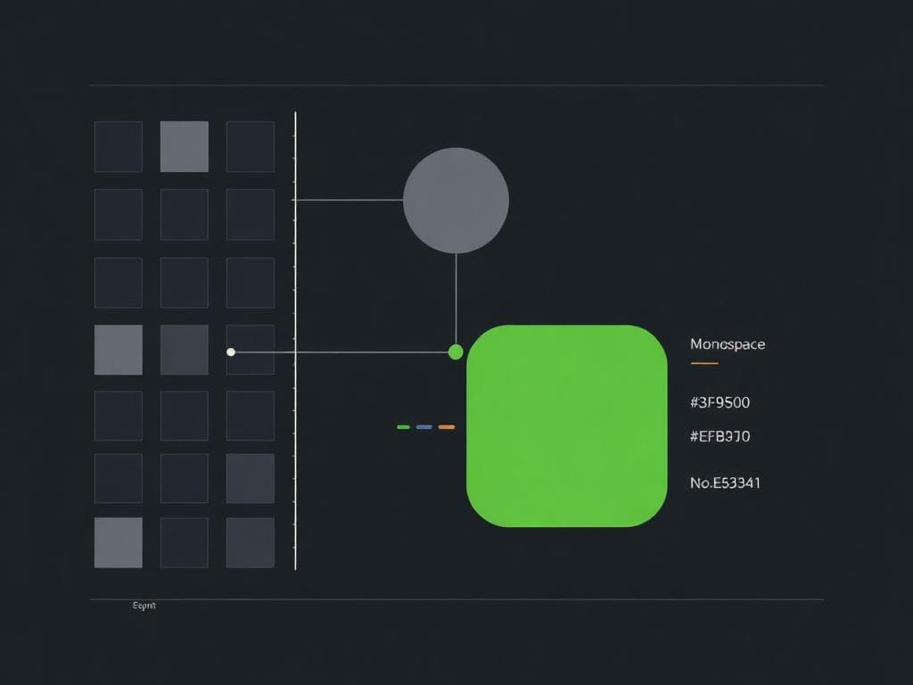
01 — Overview
Category statement. SEO operations for getting changes live. Alternate: the operating system for shipping SEO improvements.
Narrative. UN → PUSHED carries the story in decks, hero copy, and landing pages. It works because it is literally true of what the tool does: findings, prioritized, assigned, implemented, verified, live.
Taglines. Every site starts here before it goes live. Turn everything unpushed into pushed. From stuck to shipped.
UN → PUSHED
narrative headline — never a logo lockup
02 — Logo system
Primary lockup
Wordmark only — both brackets, always
Icon only — favicons, avatars, spinners
Clear space & size
- +Clear space: half the icon's width on all sides of the lockup
- +Digital minimum: 120px lockup, 16px icon
- +Print minimum: 20mm lockup, 10mm icon
Incorrect usage
- -Recoloring the green node — it is fixed and means live
- -Stretching, skewing, or rotating the icon
- -Dark lockup on a busy photo without a solid panel
- -Bracket gray swapped for white, black, or disabled-text gray
- -The animated strike-through used as a static logo
03 — Color
The palette is drawn from a code diff, because the product's value is turning unpushed into pushed. Green means shipped. Amber means waiting. Red is reserved for what is being left behind.
On light backgrounds, Pushed Green dims to #2EA043. Everything else holds.
04 — Typography
JetBrains Mono carries the brand's own voice — the logo, system status, anything the product itself is saying. Inter carries everything the reader has to absorb quickly. Never substitute a generic system monospace on customer-facing surfaces.
Display / Logo
JetBrains Mono · Bold 700
Wordmark, hero headline (UN → PUSHED)
System
JetBrains Mono · Medium 500
Status text, command palette, code-adjacent UI
Headline
Inter · Extra Bold 800
Page and section headlines
Body
Inter · Regular / Medium
Paragraph copy, descriptions
UI Label
Inter · Semibold 600
Buttons, form labels, nav
05 — Iconography & motif
Every motif shares the same git-graph DNA: a node that is not live yet, resolving into one that is. Retired directions — merge, badge, push arrow, commit stack, status row, upward push — stay on file as reference, not for reuse without design review.
06 — Voice
- +Plain over clever. Name what the product does before you name what it feels like.
- +Technical-confident. The audience knows git, crawls, and SERPs — explain the outcome, not the mechanics.
- +Active voice, always. “Push your changes live,” not “Changes can be pushed live.”
- +No apology in errors or empty states. State what happened and what to do next.
+Push your changes live.
-Submit your update for deployment.
+3 findings waiting on you.
-You have pending action items in your queue.
+Nothing waiting on you.
-No items match your current filter criteria.
+Use [unpushed] as the one permanent logo.
-Use the animated strike-through as a static logo.
+Keep the green node color fixed everywhere.
-Recolor, stretch, or rotate the icon.
+Reserve bracket-gray for the brackets.
-Reuse bracket-gray as general muted UI text.
07 — Applications
Signature component
The pending-amber status pill is the brand's signature interface moment. Use it anywhere the product tells the operator what is still waiting: dashboard headers, per-site rows, notification badges.
Icon & favicon set
- +favicon.ico — 16 / 32 / 48px, browser tab and bookmarks
- +icon-180.png — apple-touch-icon, iOS home screen
- +icon-192.png — Android home screen and PWA manifest
- +icon-512.png — PWA manifest, maskable-safe
- +mark-transparent.png/svg — the mark on colored surfaces
Merch & print
T-shirt: small left-chest lockup on heather black or ink, never oversized. Roll-up: icon top, vertical wordmark down the banner, URL as a quiet footer. Business card: full lockup on ink, back is mark-only and dimmed.
Unpushed — Brand Guidelines v1.0 · August 2026